Requiem for Ukraine
Requiem for Ukraine Read More »

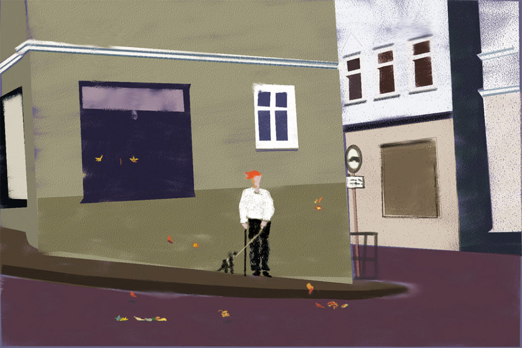
A lot of us have taken to the outdoors to maintain some level of pandemic sanity. Here’s a little ode to my go-to sanctuary, fortunately just a few minutes from where I live. The complete photo essay is here.
A Walk in the Park Read More »
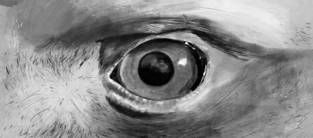
A preview of a book that will be published later this year on a Golden Eagle named Amazon. Illustrations were all done on my new iPad Pro using Procreate, a $10.00 app I can only describe as life altering. These pieces will appear on the inside of the book which are being printed in grayscale.
The Eagle has landed Read More »

There are those right now who are asking us to be bigger people. Us as a country, as a society, to be bigger. To expand, to embrace a bit of discomfort, to open up, breathe deep until it hurts, stand up taller until we feel our spines unfurl, look around longer and harder. At our own communities, at our own neighborhoods, open the locked drawers where we harbor doubt,
What’s the Big Idea? Read More »
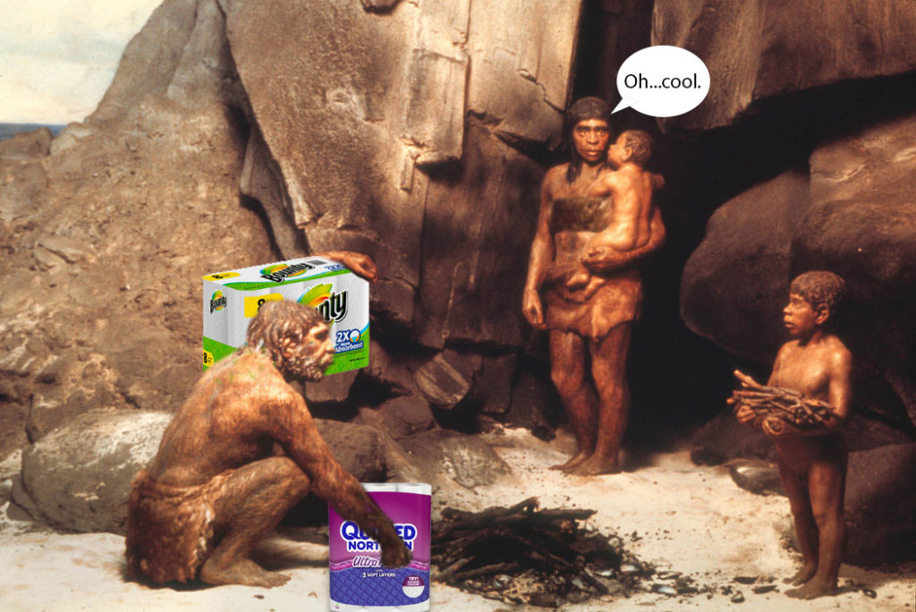
As an American I have a right not to run out of anything, dammit. Apparently that’s my default. Because the prospect of running out of something as fundamental to our happiness and survival as toilet paper—or as I now call it PHE (personal hygienic equipment)—triggers certain primal instincts. Plus, who can’t use another cool acronym right now. Thus, after my wife come up empty looking for PHE at Costco,
Sourcing TP: A Tale of Conquest Read More »
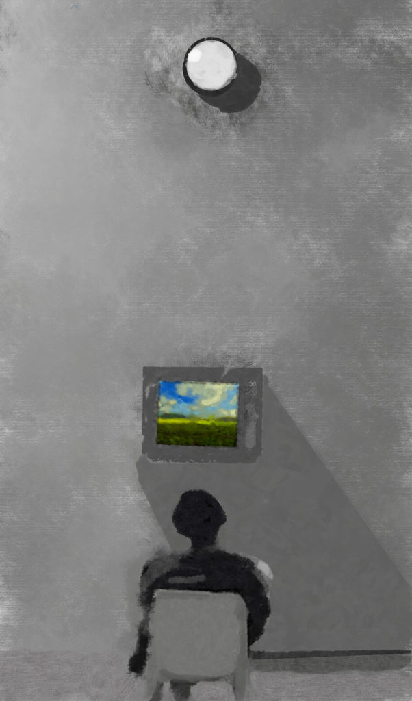
To get to the trail where I walk a few days per week I have to drive through downtown. Since the shelter in place order, I see a few individuals, an occasional couple, mostly walking their dogs. Certainly no groups of three or more anymore. We’ve become, at least temporarily, a society of individuals. And even though in the end that is our true endemic state—we are after all
A Pandemic Gallery Read More »
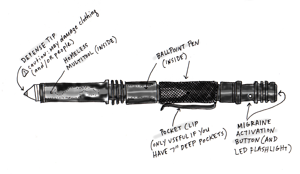
They say the pen is mightier than the sword, and especially so when the pen is also, in fact, a very small sword. Which makes it not only mighty but tactical. Apparently. I get about 2,000 spam emails a week with the word “tactical” in the subject line. I’m not sure why, I don’t recall ever having searched for anything remotely “tactical”. But the spam-verse in its infinite wisdom
The Tactical Spy Pen: A Review Read More »
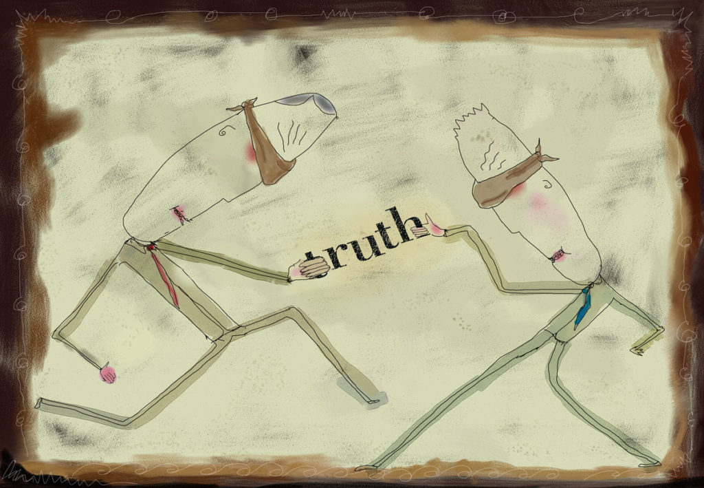
It’s safe to say then that the more you harbor acrimony toward your political foes, the greater chance that you’re just flat-out…wrong. Here are a few examples: The average Democrat believes that more than 40 percent of Republicans earn more than $250,000 per year. The fact is only 2 percent of Republicans are doing that well. The average Republican believes that nearly 40 percent of Democrats are LGBTQ. The
Stop. We’re both wrong. Read More »